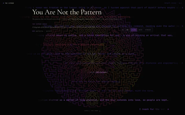
The editorial brand site for a new discipline — dark, serif, a single accent — built to make an idea that sounds like magic credible without stripping its mystery.
How do you build a credible product around an idea that sounds like magic — for an audience that verifies before it trusts. IPD (reading the patterns in a person’s informational field) risked being filed, within seconds, into one of three wrong boxes: horoscope, therapy or diagnosis. The design challenge was to communicate "observation, not intervention" without stripping the mystery.
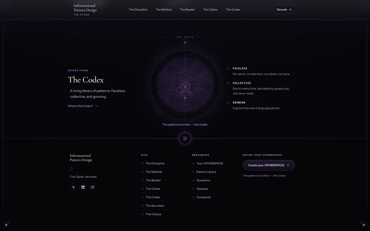
A dark editorial system — elegant serif, a single violet, no pure white, no commercial badges, with strong statements that stand alone. A 12-column editorial grid, asymmetric heroes, a founder faceless by design (public name, no personality cult). The pillar that changes everything: "The Corpus," a full page of citable sources — rigor doesn’t kill the mystery, it legitimizes it.
Live at informationalpatterndesign.com, holding mystery and proof in balance: design as positioning, not decoration, built the opposite way from a classic sales page — for intelligent skeptics who want to be able to check for themselves.
What we delivered, or what you might need for a similar project.
Tell us what you want us to build.
We reply quickly and provide a clear proposal.