
Mystery and proof: how you build a credible product for a discipline nobody knows
Informational Pattern Design isn’t therapy, isn’t horoscope, isn’t diagnosis — yet it sounds dangerously close to all three. The story of the editorial design that balances mystery and rigour, for an audience that verifies before it trusts.
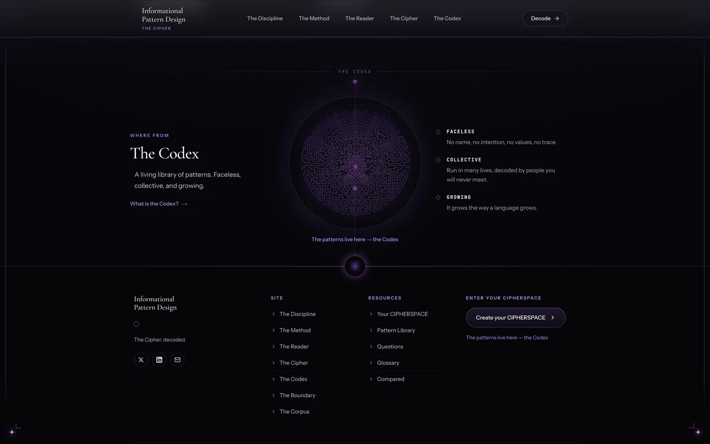
The hardest thing about building a product around an idea that sounds like magic isn’t the code. It’s making it credible without stripping away the mystery.
Informational Pattern Design (IPD) is a new discipline: reading the patterns in a person’s informational field — the shapes running underneath their decisions, behaviour and direction. Described in two sentences, it sounds dangerously close to three things people have complicated relationships with: horoscope (mystical, but unserious), therapy (serious, but regulated) and diagnosis (authoritative, but medical). The product is none of them — and that was exactly the design challenge: how do you communicate “observation, not intervention” to a visitor who, in the first three seconds, mentally files you into one of the three wrong boxes.
This article is about how you resolve that tension — not with a trick, but with a whole system of editorial and architectural decisions. And about why, for a product like this, design is positioning, not decoration.
The audience that verifies before it believes
The first decision was about who reads. It isn’t someone who wants to be told what to feel. It’s an adult at a decision point, someone who values clarity over ready-made solutions — and who, crucially, verifies before they trust. The kind of person who leaves if you over-promise; leaves if you hide who you are; leaves if you sound like coaching.
That ruled out, from the start, the whole usual “conversion” arsenal: no fake urgency, no testimonials, no “transform your life”, no colourful badges. Every element that would have “sold” harder would have lowered credibility. A product that addresses intelligent sceptics is built the opposite way to a classic sales page.
The editorial system: dark, serif, a single violet
Visually, everything starts from a dark editorial identity — not “dark mode”, but the feeling of a serious, contemplative publication. An elegant serif for titles, body text with controlled contrast, and a single accent — a discreet violet, never neon. The rule was firm: no pure white, no saturated commercial colours, nothing that “shouts”.
The layout is just as deliberate. Every major page — the discipline, the method, the boundary, the author — uses a 12-column editorial grid, ~1200px, with asymmetric heroes: the large title on 8 columns, a side column with a discreet index and micro-labels. It isn’t symmetry for the sake of balance; it’s the rhythm of a magazine, where the eye has somewhere to breathe and somewhere to stop.
One detail that matters more than it seems: strong statements stand alone. “Visibility, not healing.” “I don’t heal. I read.” Each such line gets space, italic serif, a violet rule to its left — it’s not buried in a paragraph. In a product where every word is weighed, typography carries half the argument.
The faceless founder (and why it works)
An obvious temptation for a “reading” product would have been to put the founder’s face everywhere — trust through the person. We went the other way: faceless by design. The name is public, the professional background is linked (LinkedIn), but there’s no photo, no cult of personality.
The reason is coherent with the product: IPD says “you are not the pattern; you are the one who can see it”. A product about impersonal, collective patterns can’t be allowed to become about a charismatic person. The “The Reader” page — the author’s profile — is built as an intellectual portrait, not a CV: where she comes from (design, systems, technical textiles, business), how she looks at patterns, what she does in a reading and, just as important, what she doesn’t do. Structure, observation, precision, responsibility — not promises.
The pillar that changes everything: citable proof
Here’s the move that mattered most, and the one you wouldn’t think of for a “mystical” product: an entire page of sources.
“The Corpus” is the discipline’s bibliography — the proof that readings stand on cited ground, not on intuition. The clinical foundation (Lincoln, Friedman, Keleman…), the interpretive lenses (Jung, Chevalier, Odoul…), the classification ground that overlaps with what behavioural science already names (Schema Therapy, attachment theory, Polyvagal). Named, so you can check.
For the target audience, this page does more than ten testimonials. An intelligent sceptic doesn’t want to be told “trust me”; they want to be able to check for themselves and decide. Rigour doesn’t kill the mystery — it legitimises it. A reading that can be examined is stronger, not weaker, than one that demands blind faith.
The boundary, said out loud
Counterintuitively, one of the most powerful conversion elements is the page that says what the product does NOT do. “The Boundary”: adults only, you read your own field, it isn’t clinical. It’s not a legal disclaimer hidden in the footer — it’s a visible, editorial section with a clear conclusion: “The Cipher offers visibility. You hold the decision.”
Honesty about limits is, paradoxically, the best trust signal. A product that tells you plainly where it stops is a product you can trust for what it actually does.
What’s under the hood (briefly)
Technically, it’s a modern Next.js site, with content editable from an admin (the texts are audited word by word, so nothing changes by accident), and connected to a separate public library — the Codex — through a sync that keeps two systems aligned without duplication. The engine that produces a “reading” is anchored on a real, deterministic method (the same identity → the same reading within a window), not on dice. But those details are a separate article.
What’s worth keeping here is the architecture principle, not the stack: the content’s source of truth lives in a single place, and everything else (pages, public library) mirrors from there. A word changed once propagates correctly everywhere. In a product where the exactness of the text is sacred, that isn’t a luxury — it’s mandatory.
Behind the scenes: the constraint that changes the whole workflow
It’s worth telling, because it defined how everything was built: the texts are sacred. Every word on the site is the author’s exact wording — audited, weighed, approved. The firm rule, repeated on every page: “don’t change the texts, they’re audited by Alma; we only do a design facelift”.
It sounds like a limitation. It’s actually a discipline. When you’re not allowed to touch a word, you’re forced to solve everything through structure and typography — to make a statement breathe through space and serif, not through rewriting; to add hierarchy through layout, not through new copy. Every facelift was a negotiation with a fixed text: how do you make it stronger without touching it.
The workflow was a ping-pong of screenshots. We’d build a page, bring it over, look at a screenshot from the real screen (not what I thought was rendering — what was actually visible), compare it element by element, adjust, come back. Again and again, until the discipline, the method, the boundary and the author looked like four chapters of the same publication — not four pages glued together. A counterintuitive detail of this work: what you choose NOT to put matters as much as what you do put, and a quote that repeated between one page and the footer was pulled from the body — not because it was wrong, but because the repetition would have dulled its weight.
The trap: when “more design” means less trust
It’s worth stating separately, because it’s the wrong reflex almost everyone has. For a product that sounds unusual, the instinct is to compensate — more effects, more visual proof, more “wow”. For IPD, every such addition would have hurt.
We tested it directly: variants with more “shine” (stronger glow, more visible animations, more enthusiastic copy) made the product seem less serious, not more. An audience that verifies before it believes reads exuberance as weakness — if the product is good, why is it shouting? Restraint was always the right decision: less accent, more space, more silence.
The final rule was simple and hard to keep: every element has to earn its right to be there. If it doesn’t add clarity or credibility, it goes. In a world that optimises for “engagement”, a product that optimises for trust looks — and is built — fundamentally differently.
Conclusion
A product around an idea that sounds like magic isn’t saved by code, nor by effects. It’s saved by coherence: every page, every colour, every word and every thing you choose NOT to put has to tell the same story — serious, precise, honest about limits, and just mysterious enough to stay interesting.
The mystery brings the person onto the page. The proof makes them stay. The balance between the two is the whole product.
See the full project: Informational Pattern Design and the public library The Cipher. And about how the two systems stay in sync without duplication, I wrote separately in how the Codex writes itself.
Frequently asked questions
What is Informational Pattern Design? A discipline for detecting the patterns in a person’s informational field — the recurring shapes running under decisions, behaviour and direction. It’s observation, not intervention: it names what’s there and gives it back to you. It isn’t therapy, diagnosis or fortune-telling.
Why such a restrained design for a “spiritual” product? Because the target audience verifies before it believes. Visual exuberance and big promises lower credibility with an intelligent sceptic. Restraint, space and honesty about limits build the trust that matters.
Why an entire page of sources (a bibliography)? Because a reading that stands on cited ground can be examined — so it’s stronger. “The Corpus” turns “trust me” into “check for yourself”, exactly what the audience asks for.
Why doesn’t the founder have a photo? Because the product is about impersonal, collective patterns. A cult of personality would contradict the central idea. The identity is public and verifiable, but the product stays about the pattern, not the person.
Do you have an idea that sounds too abstract to be taken seriously? Get a quote — we build the positioning out of the design, not just on top of it. See our services too.